Materials & texture
Stone, timber and cloth: a conversation of surfaces
Before naming the style of a room, we sense its surfaces. Stone suggests weight, timber introduces direction and cloth softens an edge. Even without touching them, we anticipate how they might feel. Much of a room’s character begins in this conversation.
A material changes with scale
A sample fits in the hand; a wall or cabinet fills the field of view. Timber grain that seems discreet on a small piece can become a dominant pattern across a large surface. Strongly veined stone may read as an image in its own right, asking for quieter surroundings.
Expression depends on quantity. Stone can be an accent, a background or the central volume of a room, with a different effect each time. The useful question is not simply which material appears, but how much space it occupies and from what distance it is seen.
Contrast can be tactile
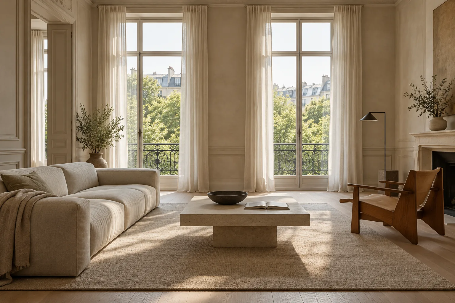
Surfaces close in colour can still have very different presences. Porous limestone and a linen curtain may share a tonal family, yet one has weight and a firm edge while the other moves and filters daylight. That opposition can give depth to a restrained composition.
Strong colour contrast is only one possibility. Matt beside polished, regular beside irregular, rigid beside supple: differences in behaviour allow a room to feel rich without breaking it into competing parts. When every finish is equally smooth, tonal harmony can slip into sameness.
The edge tells a story
The eye often settles where materials meet: a top against a cabinet, timber approaching plaster, cloth reaching the floor. These junctions reveal how elements have been imagined together. A shadow gap can separate two volumes; a continuous line can bring them into one reading.
Thickness has an expressive role too. A substantial slab communicates something different from a fine edge. Neither is universally preferable. The edge helps establish whether an object feels grounded, light, monolithic or almost suspended.
Patina makes time visible
Some surfaces remain compelling because they change. Timber may deepen in tone, leather may record use, and unprotected metal may alter in appearance. To one person these changes suggest familiarity; to another they are unwelcome signs of wear.
There is no single correct attitude to patina. The ideal image of a material should leave room for the way it will be lived with. A surface shown only in perfect condition tells the beginning of its story. In an inhabited interior, time becomes a visible contributor.
Coherence leaves room for difference
A perfectly matched room can be orderly yet lack tension. A darker object, irregular ceramic or rougher textile may introduce the difference it needs. Coherence can come from recurring relationships — an undertone, a direction of grain, a family of finishes — while leaving space for surprise.
Materials become more interesting when each contributes something specific. Timber need not dissolve into the colour of stone, and cloth need not imitate the firmness of furniture. A good conversation lets the voices remain distinct.
Reading the image
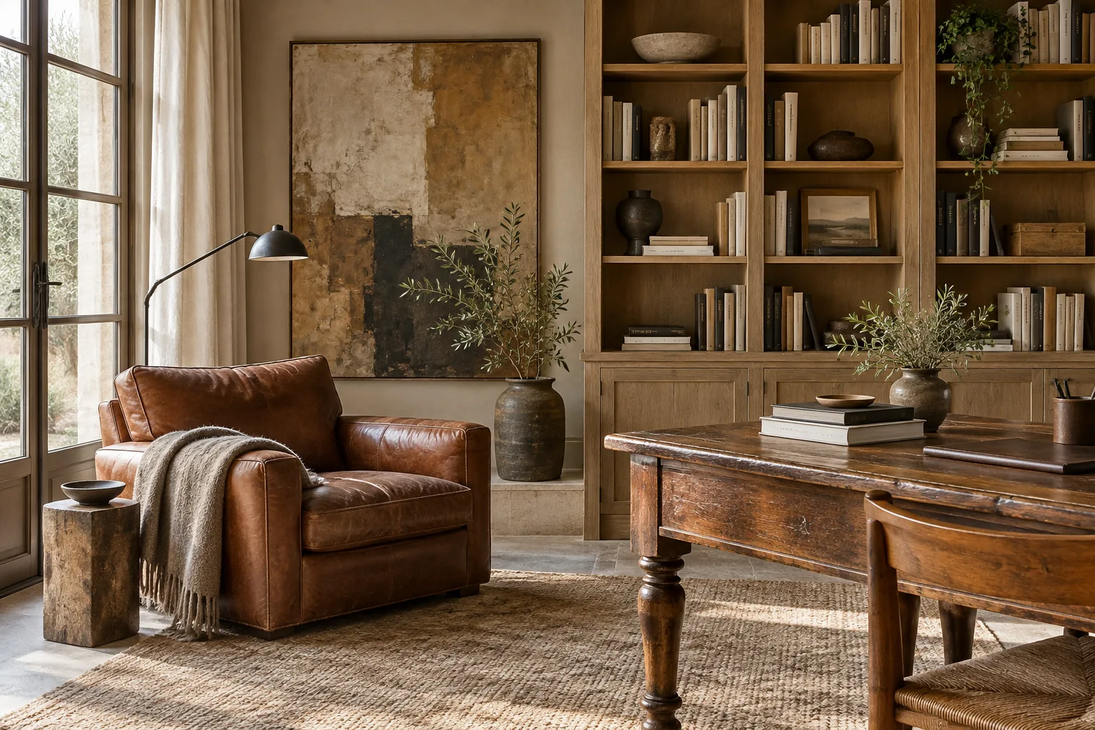
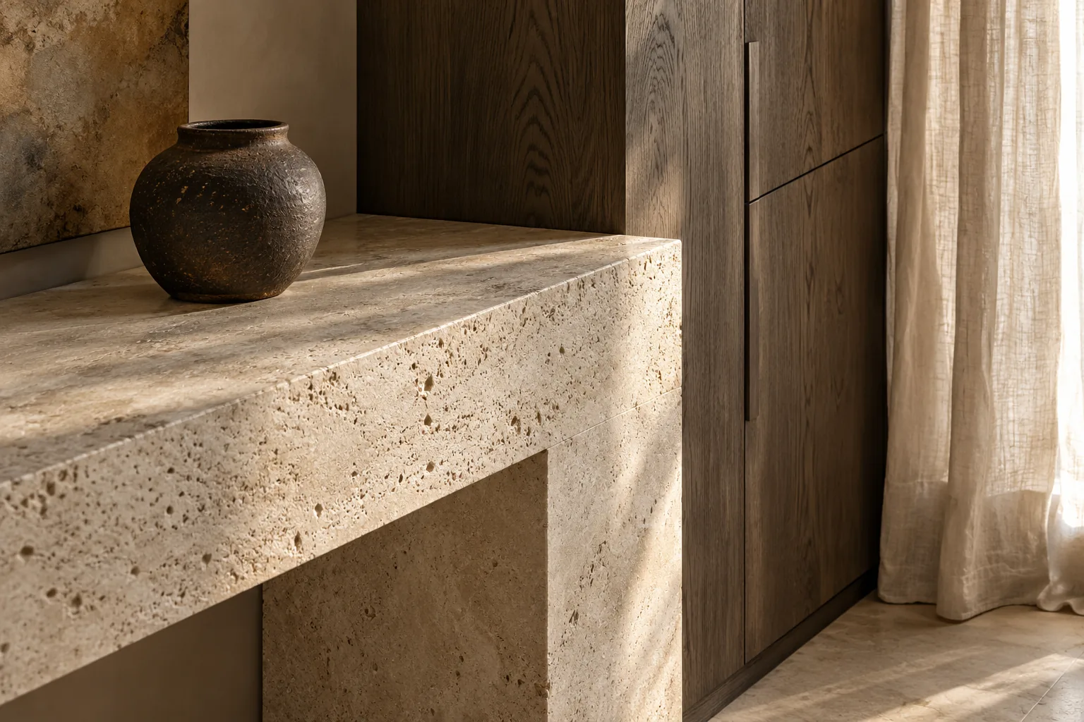
Porous stone, vertically grained timber and side-lit linen meet in this close view. The stone establishes a horizontal line, the cabinet carries the eye upwards and the curtain introduces softness. Dark ceramic interrupts the palette without adding another dominant pattern. The image is a visual study of material relationships.