Space & proportion
The quiet luxury of a room with space to breathe
Some interiors announce themselves at the door. Others emerge slowly: in the distance between two objects, the fall of a curtain, a wall left unoccupied. We are drawn to this quieter presence — a room that does not continually ask to be admired, yet rewards attention.
The space between things has a shape
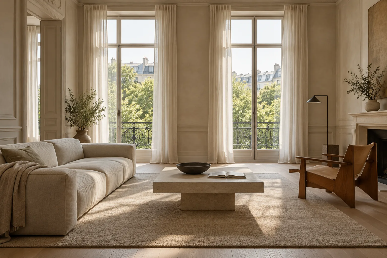
A sofa, a table and an armchair do not make a living room on their own. The intervals matter too: a route through the furniture, an opening towards a window, enough distance for each object to be understood. In a photograph these intervals can look unused. In a room they establish its rhythm.
Imagine the same furniture in two arrangements. In one, an oversized table consumes the centre and every edge is occupied. In the other, the table leaves room to move and the chair turns slightly towards daylight. The inventory is unchanged; the relationships transform the atmosphere. Generosity is felt in the ease of moving through a space as much as in its dimensions.
Calm needs a point of emphasis
Visual quiet does not require everything to be pale and unobtrusive. A dark cabinet or a large painting can give a restrained room conviction. What matters is the hierarchy: one element leads, a few support it, and others form a background.
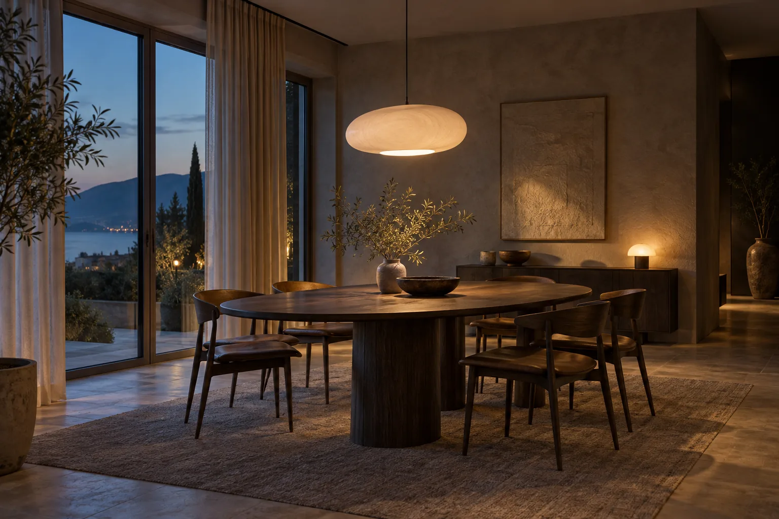
When every wall, light fitting and piece of furniture competes for attention, the eye keeps moving without finding a place to settle. A single expressive gesture can have more presence when quieter surfaces surround it. Restraint becomes a compositional choice with character of its own.
Warmth lives in small differences
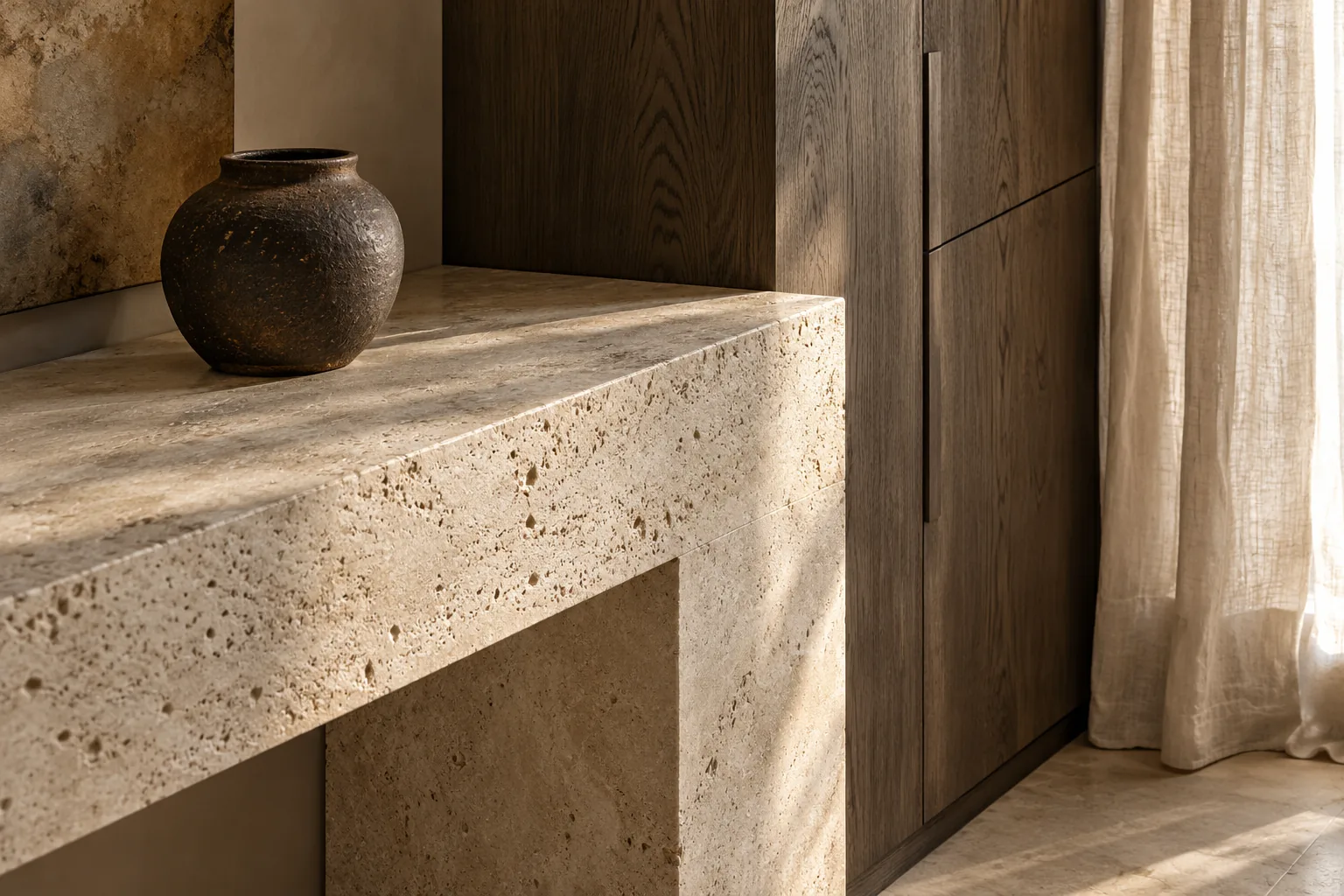
A closely related palette may sound limited when reduced to a list of colours. In a room, texture gives it depth. Linen receives light differently from stone; timber has direction; wool holds small shadows. Similar colours allow those differences to become legible.
A welcoming room need not be beige. Muted green, dusty blue or a deep brown can carry the same sense of ease. Colour works in relation to light and finish. A dark matt wall may feel more restful than a bright white surface broken by restless reflections.
Let ordinary life enter the picture
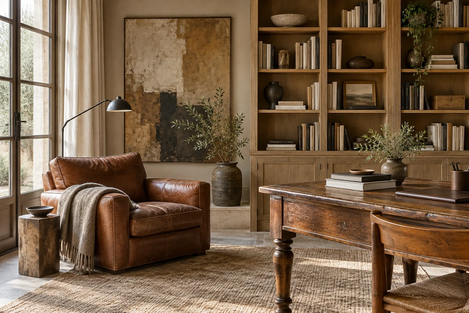
An empty interior can be convincing in a photograph and remote in daily use. An open book, an imperfectly folded blanket or a vessel kept for its shape introduces a human scale. These things acquire presence when they have room around them.
There is space for collections and temporary disorder too. Calm should not demand constant discipline from the people who live there. A coherent background can accommodate everyday belongings without losing its character. The room becomes inhabited, rather than merely arranged for viewing.
The value of a pause
An empty wall beside a full bookcase gives the collection a clear edge. An uninterrupted view towards a window brings daylight into the composition. A small table next to a generous armchair may express comfort more convincingly than a perfectly matched suite.
A pause is a way of judging relationships. How much room does each presence need to be understood? The answer changes with the house and the people within it. That variation is what makes an interior personal.
Reading the image
The low table keeps the view towards the windows open. The distance between the sofa and chair gives the centre a relaxed rhythm. Stone, linen and timber share a tonal range but retain different surfaces; the dark bowl adds a small visual anchor. This scene explores atmosphere and proportion, rather than documenting a completed commission.